The Joy of (Watercolor) Painting
This was originally posted on the website Guamology which was run by the Muna Brothers, Don and Kel, but closed down recently after a two year run. I was a writer for the website, sometimes posting every week or so, sometimes once a month. It was a very fun and very informative website and I was happy to help build it since it started in 2008.
I cut and pasted a few of the posts that I didn't have records of because they were on my old laptop which was stolen last year. I decided to share one of my painting posts below:
*************************
Welcome to another installment of the Joy of Painting! Where I take pictures and write up the progress of a painting that I am making, to go beyond the surface of an artwork, and get into the evolution, the beauty, the struggle of making it. This week’s segment is dedicated to Sarah, who requested that I try out watercolor this time around.
The joy in this post’s title is in quotes because watercolor isn’t always a joy for me. Its not a medium that I’m very good at. This will become clear as you read the progress in my painting and see how my instincts in applying paint or mixing paint all work against me when using what I see as a very delicate and precise medium. But art is supposed to be about challenging things, pushing boundaries, even if those limits being transgressed are those within the artist.
The painting for today is titled “Xiao Qiao,” the name of a historical figure from Ancient China. The image was drawn from the portrayal of this figure by the Taiwanese actress Lin Chi-Ling from the John Woo directed film Chi Bi. In English the title translates to “Red Cliff” or “Red Wall” and is based on the epic battle of Red Cliffs which was one of the key battles in making possible the Three Kingdoms Era of Chinese History. In the film the character of Xiao Qiao is supposed to be the most beautiful woman in the world, and the desire of the antagonist to have her creates the impetus for the conflict between three kingdoms. I don’t know about her being the most beautiful woman in the world, (that title currently belongs to i haggå-hu Sumåhi), but there was an elegance to her character that I did want to try and reproduce. I think it turned out pretty well.
********************************************
#1: A simple pencil sketch to start us off. I have to admit, that there have been some paintings where I started off with the pencil or pen sketch and then just left it like that because it looked nice the way it was.
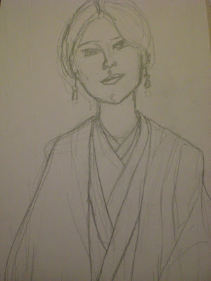
#2: One thing I always consider at this point is how dark or visible do I want this pencil sketch to be? Depending on how you paint watercolor there is a good chance that these initial lines will still be visible when you are finished. If you have a very faint or washy touch, and the lines are dark enough they will still be hanging around. This isn’t necessarily a bad thing, because the initial sketch showing through is often a really nice touch. It appears like a ghostly skeleton, or perhaps even the soul of your painting. Viewers of art often love to see touches like that, it makes them feel like they are connected with the creation of the work when they can see a fragment of its blueprint.

#3: My workspace for this painting. 24 colors that I bought from National Office supply, watercolor paper and my palette. I’ve developed a habit over the years of using CD and DVD cases for my palettes. I’m not sure why I started this, but I have dozens of cases now covered in paint. The good thing about watercolor is that it can be washed off. In honor of the founders of Guamology, I’ll be using the Shiro’s Head DVD case to paint on today. As a warning though. Ideally and traditionally, palettes are supposed to be white, or provide a neutral surface on which you can mix your colors. Using a surface already covered with colors, shapes and lines can throw off your mixing.

#4: When you paint with watercolors you’re supposed to begin with some simple, harmless washes, to start with. Black is supposed to be the enemy or the Major Bison (sorry for the random SF reference) of watercolor painters. This is so because watercolor is supposed to represent a more natural tone or palette, and black as a color never appears in nature. When painting with watercolor you are supposed to use as little black as possible. My instincts of course run contrary to this and so I always use black first, whether I’m using acrylic or watercolor. It traps the space for me, helps me visualize the potential space for painting better.

#5: Ma’å’ñao yu’ nu i mata, I’m afraid of the face, since its usually my favorite part to paint with acrylics and the part I am most prone to screwing up with watercolors. That is one thing to remember about watercolor is that painting over mistakes or parts you don’t like is far more tricky than with other media. So I decided to start with the clothes. I put down a pretty thick wash, applying more paint to some areas which would be more shaded and more water to areas which are lighter.

#6: I’m very pleased with the green wash I put down and so before ruining it I thought I would move on to the undershirts. Here Masakåtsu is displaying for all the colors that I’ll be using for the undershirt.

#7: Phew. That worked out well. I followed the folds and the shadows of the undershirt with darker blues and even some traces of purple. The rest of the shirts were all washy light blues, with some traces of yellow here and there. Lastly, just for effect I threw in some dry red lines.

#8: More paint now for Masakåtsu. I’m going to be painting over the green wash for the shirt now and so these are the colors that I’ll be using. Watercolor is a medium in which it’s ideal to have your colors figured out ahead of time before you start throwing paint on the water. The reason for this is that mixing on the paper itself can tend to make the image increasingly darker and muddier. It can also, if you really go far actually ruin the paper and pierce/soak through to the other side.

#9: The muddiness that I was just talking about is starting to happen. I was trying to place atop the deep dark green wash some multi-colored streaks or strokes to give the clothing some definition and some texture, but the colors started mixing up too much and getting too brown, ya ai adai gof chatpago ayu na amariyu lokkue’! On the sleeve in this image you can see where I’ve had to take drastic action to start over. I ended up obliterated what I’d started, covering it over with plenty of black and white. To give me another fairly even dark surface on which I can try to build texture and definition again.

#10: Yeah! Everything worked out pretty well. The style of painting, washing and mixing that I had tried for the undershirt wasn’t working on the clothes because the base I was starting with (the green) was already way too dark and deep, so the shirt rather than looking textured and regal was starting to look dirty and kalakas. I decided to forgone that strategy and instead use quick, dry strokes to create the texture. The result is that it creates a certain depth, with the streaky curvy dry lines atop a flat washy green. It worked much better and contrasts nicely with the varying strokes used for the undershirt.

#11: I’m worried that some of the problems that I had with the clothes will happen again with the face and so I’m working very tentatively and slowly. Using very light washes at first and testing out some possible color palettes. Although the original image is of a Taiwanese actress meant to be the wife of a prominent Wu Viceroy (Zhou Yu) from right before the Three Kingdom’s era of Chinese history, I’ve decided to nonetheless give her Latte earrings.

#12: Ai lana’ its all going to hell. I started off nice and slow, but let my instincts get away from me and started trying to mix on the paper. There’s a lot of lines and marks at this point that I do like, but there’s some trouble spots as well which could get muddy and gross and ruin the whole thing. I love the bleeding dark blue line which snakes down the front of the neck and so I’m hoping to find a way to leave it. I like the mixes of yellow, red and blue on the right side of the neck. On the face itself however, under the right eye I’ve thrown in some puke yellow. Its so nasty, I should have been more careful when I mixed it. It looks like that horrible couch that Sonya Artero sits on in KUAM New Extra that clashes with everything she wears. The left side of the face, the side with cooler colors is nice, but I’m worried if I keep the palette too cool, she’s end up looking like a deathly heroine from a Tim Burton movie.

#13: This is why I love thick black lines. In order to get some perspective on the painting thus far, I went over all of the main lines with black (again). I often find that when I’m screwing up with both watercolor and acrylic, this helps me see the colors differently, it helps compartmentalize the space into different sections and helps me predict which colors will work better and what my next steps should be.

#14: The solution to the face problem appears. After dumping un binila’ pinturra onto the face trying desperately to somehow make it work I decided to simply wash it out, soak the whole area with plenty of water tinged with some yellow and peach/pink. All of the colors that I initially clouded the face with are still there, they’ve been mixed into the deluge of water, creating tiny little variations. Faint traces of previous colors, lines, shapes, forms, that give an unexpected and welcome depth to the face. I divided the face into three color zones, with the cool colors, blues, grays and purples dominating the sides of the face, where the color would be the darkest, or around the nose where there’s shadow. As you moved towards the middle of the face, the area around the cheeks is flushed with reds, pinks or peaches, and eventually the yellow dominates much of the middle of the face.

#15: A close up of the face. Notice that the pencil lines are still visible and that some of the previous muddiness can still be seen in some areas.

#16: Usually my favorite part of my paintings, the eyes. At this point however I still need to fix the eye balls, since they have a sort of blue evil cyborg look to them. This is the point where all the different layers of painting, all the different mistakes too come together to make a very nice and striking image.

#17: Masakåtsu at the end of painting. Si Yu’us Ma’åse Masakåtsu na un na’usa yu’ ni’ matå-mu. Ti mappot para bei na’gasgas hao, gos faset mafunas este pinturran watercolor.

#18: Munhåyan. The background colors were just chosen at random, mainly making use of the colors still left on the palette. Then they were blended together. It works well for the background, cause all of these colors are also found throughout the main image itself and so its a way of tying everything together visually and keeping the eye happy as it moves around the painting.

****************************************************************************
Thank you once again for watching and reading the evolution of another painting in progress.
Remember, if you’re looking to beautify your life or your home, Guam has plenty of artists who create all types of work that you can choose from and can use your support!

Comments
you should have made her use spondylus earings though. "COL"